Cloud Guardrails
VMware
Guardrails is a product that allows CloudOps users to view compliance, remediation, and changes or drifts across all clouds.
Role: Designer, Co-lead
Time frame: 6 months
The Goal
Design a platform for CloudOps Admins to visualize, manage, and optimize their cloud accounts in one place.
Challenges
Time
Very tight deadlines.
No time allowed for early discovery research.
Pressure to rush designs.
Research Participants
No existing users since this was a new product.
Needed to get funding to recruit external participants for research.
Changing Requirements
Changed location / platform twice
Changes made for which features were planned.
Changes for which cloud types were supported.
Design Process
Requirements
First created by Product Manager
Design-led planning workshops
Design
Early whiteboard sketches
Wireframes
High fidelity mocks
Validation
Internal validation
Usability testing
Adjusting scope based on feedback
Delivery
UX readout to engineering
Answering questions
Quality testing
Requirements
Co-lead planning workshops with the product design lead.
This included:
Prioritize features and requirements
Evaluate terminology
Compare requirements with existing features
Assign ownership of product areas
Align cross-functional stakeholders
Map workflows for onboarding users with existing accounts and users with no accounts
Design: Wireframing
Whiteboard sketches were the earliest prototypes I used to gain alignment with other designers and with product managers on the overall flow for each use case. These are a couple of the early stage flows:
Add Account Flow:
This flow was for adding cloud environments or accounts to a project, which is a permissions group for users.
Desired State and Enforcement History:
These screens show the way users are able to interact with pieces of a file either through form fields or code, and then see the run or enforcement history of that desired state.
Design: High Fidelity Mocks
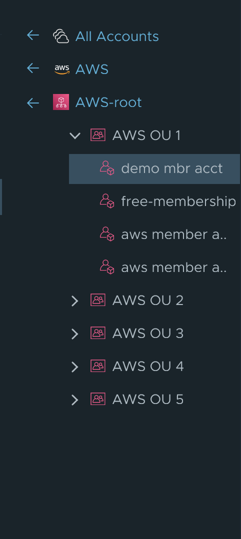
This page shows configuration, security, and compliance issues found on cloud accounts after running the desired states. Featured in this page as well as the screenshot to the right is an account hierarchy navigator, which was a completely new component. We needed something that was accessible, scale-able, and easy to use.
This page shows the default templates created in a library, which can be used as-is, or imported to the “Curated Templates” section. The category filters are surfaced to help users to easily filter the type of templates they’re looking at.
This is a close up of the previously mentioned hierarchy structure.
Validation
I had a few challenges with doing user research. Because this was a new product going into a new platform, and targeting a new type of user, there were no existing users I could reach out to.
I was able to get approval to use a vendor (User Zoom) to recruit participants. I designed an extensive research plan to test the usability of each flow, and to validate terminology, interactions, and user needs. I was able to recruit 10 participants to test with.
Validated:
100% of participants were more likely to start with library templates and customize later.
The tree nav component worked the way participants expected.
Monitor / enforce terminology was clear and easy to understand.
Needed Adjustment:
70% didn’t know the difference between Curated Templates and Library.
Using the search field to filter results was not intuitive.
Monitor / enforce terminology was clear and easy to understand.
Delivery
Lastly, I attended regular meetings with the engineering team to answer questions and design error states as needed.


